Colour isn’t just visual decoration, it directly affects how children feel, behave, and learn. In early years, where development is rapid, the right use of colour can support mental wellbeing, creativity, and even physical regulation such as calmness or energy levels.
For nurseries and preschools, choosing colours intentionally is an important part of creating a supportive and inspiring environment.
Why Colour Matters for Young Children
Children are especially sensitive to their environments. Research shows that colour influences mood, attention, memory, and even physical responses like energy or calmness (Verywell Mind – Colour Psychology).
– Warm, bright tones stimulate activity and play.
– Cool, calming tones reduce anxiety and promote focus.
– Balanced colour palettes help prevent overstimulation while still sparking imagination.
A UK study into classroom environments found that colour, alongside lighting and flexibility, can improve learning outcomes by up to 25% (Wired UK – School Design).
The Psychology of Colour in Early Years Classrooms
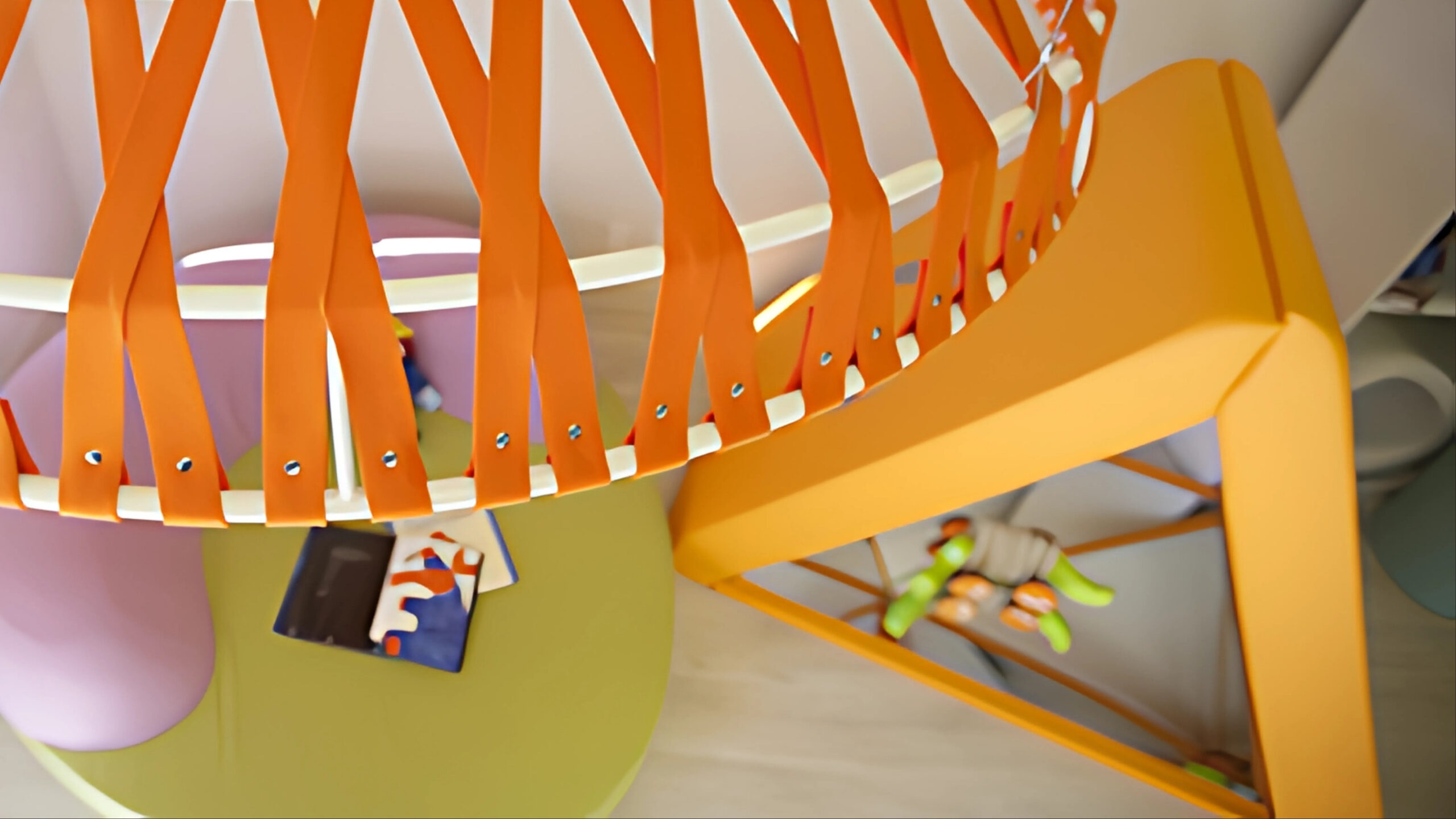
Red – Energy and Stimulation
Red raises energy levels and draws attention. In early years, it can encourage enthusiasm, creativity, and confidence. However, too much red may cause restlessness, so it’s best used in small doses—such as accents in creative or physical play areas.
Yellow – Optimism and Focus
Yellow is linked to positivity and mental stimulation. It encourages communication and helps children feel cheerful and alert. Studies show yellow supports short-term concentration, making it effective in learning or group activity zones.
Blue – Calm and Security
Blue has a calming effect on the nervous system, helping reduce anxiety and overstimulation. It’s ideal for reading corners, nap spaces, or quiet areas. Research also links blue to lower heart rates and reduced physical tension, making it valuable for supporting children’s self-regulation (McMillan Pazdan Smith – Colour in Early Childhood Design).
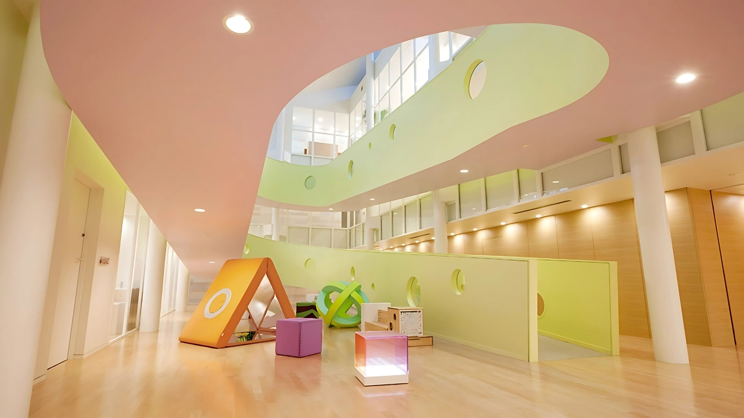
Green – Balance and Concentration
Green represents growth, balance, and a connection with nature. It helps children feel secure and relaxed while supporting sustained attention and memory. Classrooms that incorporate green shades (on walls, furniture, or soft furnishings) often see improved focus and reduced stress.
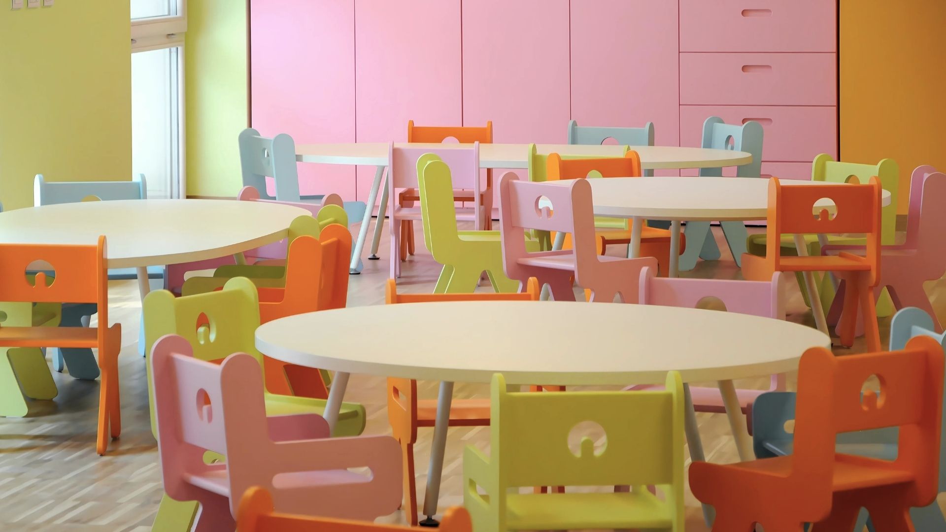
Orange – Warmth and Sociability
Orange combines the energy of red with the optimism of yellow, making it friendly and welcoming. It encourages social interaction, collaboration, and creativity. Orange can be especially effective in group activity zones where communication and cooperation are key.
Purple – Creativity and Imagination
Purple is associated with imagination, storytelling, and emotional depth. It can inspire role play, art, and creative thinking. In early years settings, purple is best used in small bursts—like soft furnishings or play corners—so it stimulates without overwhelming.
Neutral & Natural Tones – Balance and Calm
While colour brings energy, neutrals provide essential balance. Whites, greys, and wood tones create breathing space between bright zones, helping prevent sensory overload. In early years, a balance of bold colour + calming neutrals supports both exploration and rest.
Colour & Wellbeing in Early Years
Mental health
Balanced colours can reduce anxiety, lift mood, and encourage emotional resilience.
Behavioural regulation
Calm tones like blue/green help with self-control, while warm tones encourage activity.
Physical responses
Research shows colours can influence physiological reactions, including heart rate and energy levels (Scirp – Colour Research in Early Childhood).